
How to create the perfect PowerPoint presentation?
Visualization of information has become an integral part of our lives. Can you imagine at least one conference, lesson or event without a visual presentation of the material? Sometimes it’s quite difficult. Each person wants to be heard, therefore, in order to convey complete information to the audience, it is most often necessary to present it in a convenient form – presentations. A presentation is a set of slides that include text, images, graphs, tables, and videos.
Structure of a PowerPoint Presentation
Each presentation should have a structure, namely:
- Introduction – a short description of the topic, the purpose of the presentation.
- Questions to be considered or problem to be solved.
- The main part that answers all the questions posed or gives a solution to the problem.
- Conclusion, which reminds the main thoughts, calling for some action.

It is worth sticking to these points, because this is the first step to a perfect presentation. The second step is the information that you want to convey to the audience, it should be informative, interesting and understandable. The last step is the design, which should attract your listeners.
In order to create a presentation, you must have any version of Microsoft PowerPoint on your computer, and this product is also available in an online version on the Microsoft website.
Presentation design in PowerPoint
The program has ready-made templates, but what if they do not fit your theme? Create an empty presentation, adhering to some requirements:
- The slide size must be 16:9. (This item can be found in the Design tab).

- A font that should not be repulsive, be readable. In a presentation, it is best to use 2 or 3 font types. The most commonly used combinations are Times New Roman, PT Serif or Friz Quabrata for headings, and Calibri, Muller, Roboto, Futura, Mariad Pro, Helvetica, Gill Sans or Open Sans for text. It is also recommended to choose one font, while using its boldness, so use bold for headings, regular text, and italics for notes. Any fonts are suitable for the screen, but sans-serif fonts are suitable for the projector. Size for headings should be 36 pt or more, for text – 22 pt or more. Do not forget that the length of the lines should not be long and be about 40-80 characters, and the number of lines should not exceed 5. The text should be aligned to the width of the slide.
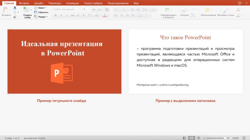
- The color of the background and symbols are very important and should look harmonious. It is recommended to use a white background and neutral colors of the symbols themselves. You should not put red text, it is enough to highlight only the title in red to interest the audience. The title slide can be designed in any style, the main thing is that it makes the viewer understand the topic of the conference, lecture, event.
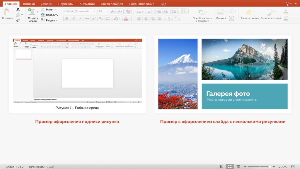
- If necessary, it is worth highlighting slides for pictures, tables, charts and videos, not forgetting to put a title or a small note, signature.
- If you have no idea what a composition is, then in the Layout section you can use these tips, placing the data on the slides correctly.

The main task of your presentation is to convey information to the audience. By adhering to some requirements for structure and design, you can easily be heard.
Internet marketing expert. Head of marketing agency MAVR.
Business degree “Master of Business Administration” (MBA).