
Какие тексты «выгоняют» посетителей с вашего сайта
Перед написанием статьи я провела небольшой опрос среди тех, кто активно пользуется интернетом для поиска информации, деловых партнеров, товаров и услуг.
 И вот что из этого получилось.
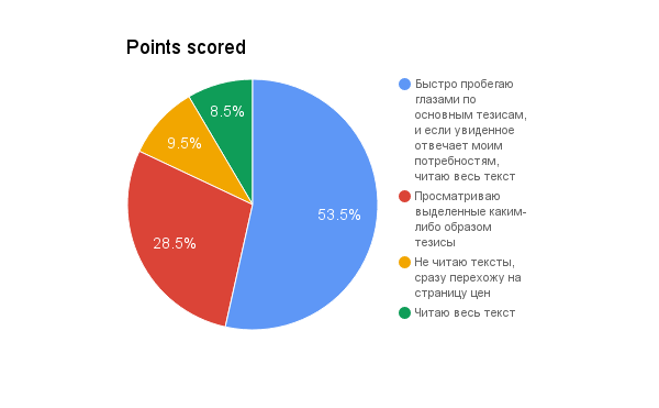
В сумме 90,5% пользователей читают тексты на сайтах: кто-то более поверхностно, кто-то — вдаваясь в подробности. И только 9,5% признались, что вообще не обращают внимание на тексты, а сразу переходят, например, на страницу цен. Получается, что текст — один из основных путей коммуникации с посетителями вашего сайта. Он необходим точно так же, как менеджер, встречающий потенциальных клиентов в офисе.
Представьте, вы пришли в мебельную студию заказать, например, кухню. Менеджер не отвечает на ваши вопросы, по сто раз повторяет «купить кухню недорого», а его речь представляет собой сплошное «бу-бу-бу» на одной ноте. На сколько вас хватит? Я бы и двух минут не выдержала.
Тексты работают аналогично. Давайте разберемся, что заставляет пользователей сбежать с сайта.
Заголовок и первый абзац «ни о чем»
Гугл считает отказом сеанс с просмотром только одной страницы без учета времени. А Яндекс называет отказом тот визит, в течение которого посетитель провел на ней не больше 15 секунд. Только представьте, за такое короткое время человек успевает оценить качество контента и принять решение: продолжать знакомство с сайтом или нажать на крестик в правом углу.
Чтобы посетитель сказал сам себе: «О, вот это интересно» и задержался еще немного, необходимо привлечь его внимание заголовком.
Заголовок должен быть простым, понятным, отражающим суть текста. Но самая главная его задача — отвечать интересам и потребностям целевой аудитории. Не просто «Детские игрушки», а «Развивающие игрушки из дерева для детей 2-3 лет». Не «Установка кондиционеров», а «Установка кондиционера в офис за 2 часа».
 Первый абзац, или лид-абзац, призван заинтриговать пользователя, дать ему понять, что он действительно нашел то, что искал.
На его прочтение обычно уходит не больше 5-7 секунд. Достаточно всего нескольких строчек, чтобы убедить пользователя в полезности и выгодах вашего предложения. Как построить такой абзац?
- Сторителлинг. Расскажите краткую историю о том, как кто-то с помощью вашего товара или услуги решил ту же проблему, которую стоит перед посетителем вашего сайта.
- Фактаж. Цифры подтверждают полезность текста, формируют лояльное отношение клиента к вашему офферу.
- Скользкая горка. Начните с короткого интригующего предложения из 2-3 слов. Вовлекайте читателя за счет любопытства, присущего каждому человеку. И в конце абзаца пообещайте, что из текста он узнает, в чем же кроется секрет.
- Перевернутая пирамида. Она работает с точностью до наоборот. В абзаце-лиде вы раскрываете все выгоды вашего предложения, отвечаете на основной вопрос читателя. Заинтересовавшись, он обязательно изучит весь текст, в котором вы даете дополнительную полезную информацию.
Убирайте из абзаца-лида (и вообще из текста) штампы и банальности: «ни для кого не секрет», «с каждым годом в продаже появляется все больше гаджетов», «инновационные технологии обеспечивают высокое качество», «все автомобили нуждаются в сервисном обслуживании». Скучища, да? Неудивительно, что наткнувшись на такое, пользователь просто-напросто сбегает с сайта.
Отсутствие пользы и выгод для посетителя
Уж сколько раз твердили миру (с), что в текстах польза быть должна. Каждое предложение должно служить ответом на вопрос пользователя. В идеале, к концу страницы посетитель сайта превращается в клиента, потому что вы доказали ему, что ваш товар или услуга реально решают его проблемы.
Текст должен отвечать на вопросы:
- Что будет, если я куплю этот товар/закажу услугу?
- Какие выгоды я получу?
- Чем эта компания лучше других?
- Можно ли доверять этой фирме?
- Как работает этот продукт, насколько он надежен?
- Сколько стоит?
- Доставят ли мне заказ на дом?
Полный перечень вопросов вы сможете составить только тогда, когда изучите свою целевую аудиторию и узнаете, что именно их волнует.
Включайте в текст информацию, важную для покупателей. Простой пример: какой фен выберет девушка: мощностью 1500 Вт или тот, который сушит длинные волосы за 10 минут? Как представитель целевой аудитории, я бы выбрала второй.
«Кирпич» или «простыня»
Думаете, текстов-простыней уже не бывает? Да ладно. Не нужно даже идти дальше первой страницы выдачи, чтобы увидеть такое:
Текст-простыня, в котором не за что зацепиться
Или такое:
Текст-кирпич от юридической фирмы. Вам хочется через ЭТО продираться?
Вы уже знаете, что большинству людей важно четко видеть основные тезисы текста, а для этого необходимо:
- Разделить текст на абзацы. Один абзац — одна мысль (четко по Ильяхову ?). Сверху и снизу абзаца оставляйте пустые строки для лучшего восприятия.
- Написать ясные подзаголовки, быстрое прочтение которых даст четкое представление о содержании страницы. Читатель, за несколько секунд окинув взглядом их все, выберет ту информацию, которая интересует его больше всего.
- Использовать нумерованные и маркированные списки. Своим внешним видом они резко отличаются от основного текста и тем самым привлекают внимание пользователя.
- Подписывать изображения так, чтобы подпись перекликалась с основной темой проиллюстрированного абзаца.
- Выделять важные мысли жирным шрифтом или курсивом, для отдельных слов можно воспользоваться и капслоком. Подчеркивание — прерогатива гиперссылок.
- Создавать врезки и блоки цитат, выносить на поля
- Разместить в тексте изображения. Они разбавят черно-белую простыню, задержат взгляд читателя и помогут ему за одно мгновение уловить основной посыл текста.
Пример выноски за пределы основного текста важной информации
Оформляйте текст так, чтобы раскрыть его смысл, а не показать ваше знание правил типографики. Пользователь должен мгновенно выделить то, что заставит его остаться на сайте, а не то, что, как вам показалось, будет красиво смотреться вот именно здесь.
100500 ключей
 Раньше было достаточно запихать в текст как можно больше ключей, чтобы страница вышла в ТОП. Сегодня заспамленность нередко становится причиной удаления сайта из поисковой выдачи. Да и читать текст, в каждом предложении которого встроены неудобоваримые конструкции типа «пластиковые окна недорого купить москва», невозможно.
Как одновременно подстроить текст под ожидания пользователей и требования поисковых систем?
- Использовать релевантные тематике ключи, разбавлять их другими словами
- Сокращать количество запросов за счет их объединения
- Склонять ключи по падежам и цифрам
- Группировать запросы по узким тематикам и составлять на их основе заголовки
- Использовать ключи в подписях к изображениям, в подзаголовках таблиц
- Писать тексты, которые интересно читать и которыми хочется поделиться с друзьями
Такой подход положительно скажется на ранжировании сайта и не отпугнет пользователей.
Нечитабельный вид и цвет шрифта
На современных сайтах такие ошибки встречаются редко, чего не скажешь о сайтах-долгожителях. Небольшие изменения способны значительно уменьшить показатель отказов.
- Вид шрифта. Варианты, удобные для чтения в Интернете, — Arial, Verdana, Tahoma и другие шрифты без засечек. Вместо них иногда можно встретить шрифт, больше подходящий для бумажных документов, — Times New Roman. Вот эти мелкие черточки, которые завершают каждый элемент буквы, хуже поддаются оцифровке и делают текст на экране компьютера/планшета/смартфона менее читабельным.
- Размер шрифта. Многие источники рекомендуют кегли 10-12, но мой опыт показывает, что такой размер букв слишком мал. И дело тут не только в моей близорукости, все-таки для работы с сайтами я надеваю очки. Мелким будет даже 13 кегль, если речь идет не о мобильной версии сайта, открываемой на малых экранах. Исключение составляют интернет-магазины, где необходимо разместить большое количество информации в компактной карточке товара.
 Выбирая размер шрифта, необходимо изучить статистику экранных разрешений посетителей вашего сайта. Если большинство из них пользуются настольным компьютером/ноутбуком, выбирайте 16 кегль. Он, при условии удаления экрана на 50-60 см от глаз, воспринимается точно так же, как 12 кегль в книге, которую мы во время чтения держим гораздо ближе.
- Разнообразие стилей. Текст на сайте — не раскраска, не стремитесь разнообразить его с помощью разных типов шрифтов, цвета букв и цвета заливки. Постоянная адаптация глаз сначала к одному виду текста, затем ко второму, к третьему и так далее утомляет зрение. Рябь в глазах заставляет пользователя буквально сбежать с сайта — тем более, что множество цветов и начертаний не способствуют фокусировке внимания, а наоборот, рассеивают его.
- Выравнивание колонки. Один из приведенных выше примеров наглядно показал, как неудобно читать статью, выровненную по ширине. Обратите внимание на неравномерные пробелы между словами. А если текст еще сопровождается хаотичным отступом красной строки, создается впечатление, что клиентов здесь просто-напросто не уважают. Для комфортного чтения слева направо необходимо выравнивать текст по левому краю. Это увеличивает скорость чтения и улучшает визуальное восприятие текста.
Оптимальная ширина колонки — не более 50-60 символов. Проверьте, не растягиваются ли строки на большее количество знаков на широкоформатных мониторах.
- Фон и контрастность. Слишком высокая контрастность быстро приводит к утомлению глаз, поэтому сочетание белоснежного фона и ярко-черного цвета постепенно уходит в прошлое. Для фона все чаще используют более мягкие оттенки белого: молочный, алебастровые, светлый беж. Черный шрифт меняют на серый.
Другая сторона медали — когда на светлом фоне не виден светлый текст. Соблюдайте баланс. Будьте осторожны при размещении текста на многоцветном изображении/фотографии, когда он частично оказывается то на светлой, то на темной зоне. В некоторых случаях требуется однотонная подложка.
И не забывайте о грамотности. Одна-две отсутствующие запятые не изменят отношения к вашей компании, но часто встречающиеся опечатки и грубые орфографические (синтаксические, грамматические, лексические) ошибки снижают лояльность клиентов.
Посмотрите свежим взглядом на тексты, размещенные на вашем сайте. Есть что исправить? Все-все, больше не отвлекаю, занимайтесь).
Автор: Ольга Тонкушина. Копирайтер с 2010 года. Работает с проектами строительной, мебельной и ювелирной тематики.