
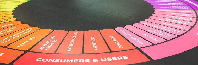
Влияние цвета на покупательскую способность
Действия людей подвластны конкретным эмоциональным законам, понимая которые можно значительно повысить спрос на определенный товар. На подсознание влияют мелкие детали, такие как запахи, ощущаемые в воздухе, цветовая гамма, звуковой фон и другие, которые мы рассматривали в статье про сенсорный маркетинг.
Сегодня мы поговорим о цветовом восприятии.
Современные исследования показывают, что у 93% людей на принятие решения о покупке оказывает влияние внешний вид товара, а у 83% – цвет. Именно поэтому в последнее время настолько сильный интерес стал придаваться дизайнерскому оформлению упаковки. Она является выгодным приемом увеличения привлекательности продукта, в результате которого происходит увеличение продаж.
 Каждый цвет должен быть логично связан с предлагаемым товаром. Так, людей с низким материальным уровнем привлекают цветной фон с насыщенными цветами. Люди с достатком предпочитают более спокойные оттенки, пастельных тонов.
Современные исследования дизайна упаковки показали, что имеется определенная психологическая взаимосвязь цвета и его восприятие человеком.
Цвета
Чтобы повысить рост продаж, упаковка обязана быть красочной, с первого взгляда приковывающей интерес потенциального клиента. В ходе огромного количества рекламных исследований, было подтверждено, что товары, обертка которых оформлена с употреблением жёлтого, красного, оранжевого и иных, так называемых, тёплых оттенков, продаются гораздо быстрее, чем похожие продукты, оформленные в другой цветовой палитре.
Каждый конкретный тон, как и его оттенок, по-разному сказывается на эмоциональном состоянии человека и его физиологии. Понимая и принимая во внимание эти особенности, можно пробудить конкретные нужные ассоциации и чувства. Поэтому профессиональные рекламщики используют конкретные цвета, чтобы воздействовать на выбор покупателем того или другого продукта.
Цветовая гамма используемая для конкретной продукции:
- Чтобы передать освежающую свежесть или же прохладу освежающего напитка, необходимо выбирать холодные тона.
- Синий вызывает удивительный эффект. Он создает ощущение доверчивости и безопасности. Его используют в банковских системах и сфере бизнеса.
- Темные оттенки синего применяются для рекламы книжек, кинокартин и осветительных устройств.
- Коричневый цвет связан с ароматным кофе, молочным шоколадом или же горячим чаем.
- Черный считается мощным цветом, которым пользуются в целях продвижения продукции, относящейся к категории роскоши.
- Розовый олицетворяет романтику и женственность. Им пользуются для продвижения продукции для женской аудитории.
- Зеленый применяется для достижения расслабляющего эффекта. Он приятен для глаз и ассоциируется с достатком.
- Насыщенно голубой цвет символизирует утонченность вкуса и эксклюзивность, чаще всего его применяют в рекламных обзорах страховых агентств, табака и дорогих алкогольных напитков. А также, все, что связано с независимостью, расслаблением, развлечениями на море, кремами для загара в сознании общественности ассоциируется с мягким небесным оттенком.
- Фиолетовый имеет успокаивающее и умиротворяющее воздействие. Этот цвет больше всего востребован в индустриальной промышленности, выпускающей антивозрастную продукцию и товары для красоты.
- Жёлтый – цвет активности. Он пробуждает в человеке желание действовать и несёт в себе заряд оптимизма. Чтобы привлечь внимание клиентов к витринам, пользуются этим цветом.
- Оранжевый считается агрессивным тоном. Он призывает к таким действиям как: продажа, регистрация, покупка.
- Красный – цвет любви. Стимулирует желание действовать. Исследования экспертов выявили, что этот тон активизирует пульсацию. Так, к примеру, изготовители пищевой продукции применяют красноватого цвета упаковки для конфет, кетчупа, нектаров. Алые оттенки приходятся по вкусу и представителям сильного пола. Например, почти все табачные изделия, средства личной гигиены имеют упаковку с этим тоном. Он также может применяться для массовых распродаж.
- Мягкие цвета доминируют в рекламе продуктов для детей.
Зная конкретное влияние тонов на психологию человека, можно использовать ее для продвижения своей продукции.
Эксперт в области интернет-маркетинга. Руководитель маркетингового агентства MAVR.
Бизнес-степень «Мастер делового администрирования» (MBA).