
Exit pop-up: п’ять порад, як залишити користувачів на сайті
Якщо відвідувач спрямовує курсор до червоного хрестика на вашому сайті, це означає для вас втрачену конверсію, а з нею і прибуток. Можливо, користувач занудьгував на сторінці або не знайшов відповіді на свій запит. Проте у вас ще є шанс зацікавити його та переконати залишитися на сайті, і це одна з технологій pop-up реклами – exit intent. У статті розглянемо це явище та наведемо декілька прикладів використання спливаючих вікон.
Що таке exit pop-up та як це працює?
Exit pop-up – це майже звичайна спливаюча реклама, проте вона налаштована так, щоб з’являтися безпосередньо у той момент, коли користувач збирається закрити сторінку. Для цього на сайті має бути відстеження рухів курсору. Тільки-но він наближається до червоного хрестика, на екрані з’являється привабливе вікно з цікавою пропозицією. Відвідувач точно зверне увагу, а ви матимете нагоду переконати його не залишати сайт.
Чи ефективна ця технологія? Так, її використання здатне зупинити до 35% людей, і вони залишаться на сайті. Від вас необхідно лише зробити рекламний банер дійсно привабливим та цікавим. Пропонуємо декілька порад та ідей – обирайте, що відповідає вашому бізнесові.
«Зачекайте!»
Ви навіть зараз звернули увагу на це слово, чи не так? Pop-up вікно із закликом зачекати також змусить людину зупинитися та переглянути повідомлення на банері. Ваша задача на цьому етапі – зробити користувачеві таку пропозицію, від якої він не відмовиться. Тобто спочатку вам необхідно викликати зацікавленість, а потім переконати людину залишитися на сайті.
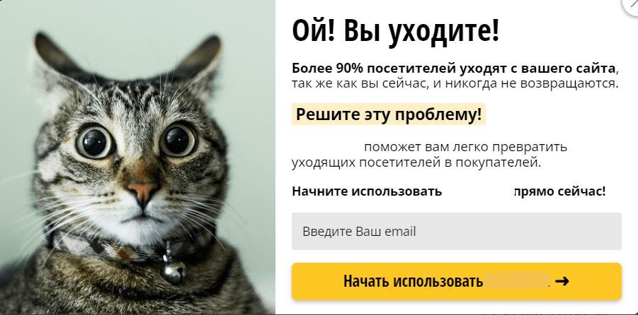
Реклама – місце для гумору
Смішний мем чи милий котик – такі ілюстрації напевно привернуть увагу та спонукають вчитатися у пропозицію. До того ж вони створюють гарний настрій і роблять образ вашого бренда позитивним, веселим, легким, а отже таким, з яким варто співпрацювати. Однак пам’ятайте, що ілюстрація має відображати філософію вашої компанії. Тобто якщо у вас серйозна юридична фірма, навряд чи такий гумор буде доречним.
Соціальні докази дійсно працюють
Особливо у поєднанні з цифрами. Взагалі цифри сприймаються дуже гарно, вони асоціюються з точністю і на підсвідомому рівні спонукають до дій. У спливаючому вікні можна написати щось на кшталт «Цю книгу замовили вже 1000 разів, знаєте, чому?» Тут і число як соціальний доказ, і гра на зацікавленості – що ж у тій книзі такого? До того ж люди схильні орієнтуватися на інших, адже більшість помилятися не може.
Подарунки та знижки – кращий мотиватор
Можливо, відвідувач завітав на ваш сайт з тією ж метою, що й раніше до конкурентів, – подивитися асортимент та порівняти ціни. Зробіть привабливу пропозицію, надайте знижку, запропонуйте невеличкий подарунок чи безкоштовну доставку, і у вас вже буде перевага перед конкурентами. Так, зараз ви зробите знижку, проте є немалі шанси, що випадковий відвідувач стане вашим постійним клієнтом, а це завжди історія про прибуток.
Ми всі любимо очима
Це дійсно так, коли мова про рекламний контент. Щоб привернути увагу до банера, можна використати:
- Контрастні кольори. Проте вони мають гармоніювати з основними відтінками сайту, щоб ефект не був зворотним.
- Зображення. Якщо на банері лише текст, його прочитає дуже мала кількість людей. Швидше за все, він взагалі залишиться поза увагою. Коли влучні слова доповнені тематичними ілюстраціями, ви отримуєте ефективний рекламний інструмент.
- Анімацію. Динамічні зображення привертають більше уваги, ніж статичні. Проте будьте обережними: швидкість рухів на ілюстрації не повинна бути занадто високою, інакше ви досягнете лише роздратування користувача. Занадто контрастні кольори у цьому випадку також не принесуть користі, бо буде перевантаження на очі.
Це лише кілька порад, які стануть у нагоді. Експериментуйте та не забувайте проводити тестування, щоб виявити, що найкраще працює саме для вашої аудиторії.
ℹ️ Матеріал розміщений на правах реклами
Експерт в області інтернет-маркетингу. Керівник маркетингового агентства MAVR.
Бізнес-ступінь “Майстер ділового адміністрування” (MBA).