
Как понять почему клиенты не покупают на сайте?
Большинство бизнесменов после запуска интернет-магазина сталкивается с проблемой низкого объема продаж через него. Это касается и новых проектов и уже работающего бизнеса, пытающегося привлечь новых клиентов из сети. В общей сложности я могу перечислить больше 100 причин почему клиенты не покупают на сайте. Сегодня предлагаю сосредоточиться на ключевых проблемах и способах их решения с помощью сервиса Plerdy.
Вам может казаться, что сайт создан идеальный, но покупок все равно мало. Практика показывает, что все обилие возможных причин этого сводится к 3-м проблемам:
- внутренние проблемы – сюда отнесу проблемы с самим сайтом. Например, плохое юзабилити, непроработанность мобильной версии, отсутствие товаров в наличии. Наличие таких причин отталкивает клиентов от сайта и соответственно от бренда. Понимая это, поисковые системы понемногу ухудшают позиции Вашего сайта. Таким образом Вы теряете своих потенциальных клиентов;
- внешние проблемы – неверно выстроена/отсутствует маркетинговая стратегия. В итоге даже при качественном продукте о нем не узнает основная целевая аудитория;
- работа отдела продаж. Если с предыдущими пунктами все в порядке, но клиентов все равно мало, обратите внимание на менеджеров, возможно, именно на этом этапе клиенты и теряются.
Чтобы понять почему клиенты не покупают на сайте, предлагаю подробнее остановиться на самых распространенных внутренних проблемах сайта.
10 причин почему люди не покупают в Вашем магазине
Я приведу пример только 10 ошибок, которые Вы можете встретить на своем сайте. Исправив только эти ошибки Вы сможете увеличить онлайн продажи минимум вдвое.
Отсутствие понятной и удобной структуры сайта
Чаще всего эту ошибку допускают интернет-магазины, имеющие большой ассортимент товаров. Но есть и корпоративные сайты, структура которых просто ломает стереотипы.
Из основных ошибок в этом пункте отмечу:
- обилие категорий в главном меню. В главное меню рекомендую выводить общую категорию товаров. Уже перейдя на нее пользователь сможет выбрать необходимый товар;
- отсутствие структуры как таковой. Нет общей кластеризации товаров в соответствии с их родительской категорией. Поэтому в одну категорию товаров может входить и ноутбук и мобильный телефон;
- отсутствие фильтров и тегов, невозможность гибко настроить результаты поиска;
- отсутствие блоков с самыми популярными товарами, теми категориями, на которые есть скидки.
Архитектура не должна запутывать пользователя. Мой совет: чем легким и меньшим Вы сделаете меню сайта, тем больше клиентов будет у вас покупать.
Отсутствие какой-либо конкретики на страницах (отсутствует описание товара или категории)
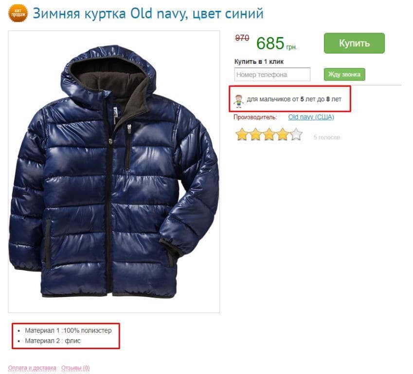
Выбирая товар клиент обращает внимание на описание товара и его характеристики. Вы наверное удивитесь но до сих пор некоторые интернет-магазины и сайты не имеют качественных описаний карточек товаров и категорий товаров.
Ошибкой будет слишком короткое и слишком длинное описание товара. При оформлении карточки товаров:
- обязательно указывайте технические характеристики;
- сообщайте цену;
- не увлекайтесь с пространными описаниями. Посетитель хочет получить информацию о товаре, а не читать художественное произведение.
Не стоит забывать и об отзывах. Стимулируйте своих пользователей оставлять отзывы или вопросы о товаре.
Слишком сложная система оформления заказа
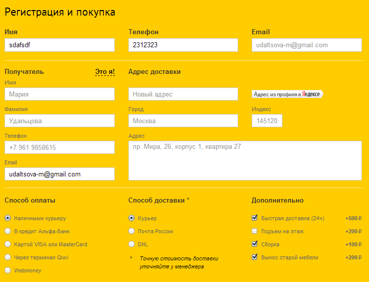
Я понимаю, что о клиенте Вы хотите знать как можно больше, поэтому и заставляете заполнить +100500 полей перед успешным оформлением заказа. Но, 50% пользователи покинут заказ, если им придется заполнять много полей.
Ключевая ошибка – требование обязательной регистрации на сайте для оформления заказа. Процедура несложная, но клиенту проще перейти в другой магазин и сделать заказ там, чем регистрироваться у вас, тратить время и рисковать потом регулярно получать спам.
Заказ должен оформляться в несколько кликов. Это обязательное правило для современного интернет-магазина.
Некачественные фото товаров либо их отсутствие

Визуальная составляющая играет огромную роль в принятии решения потенциальным покупателем. Товар должен выглядеть эффектно. Вам понадобятся не только высокое разрешение фото, но и грамотно выбранный ракурс, освещение.
Лучше потратиться на фотографа. Компромиссный вариант – попросить фото у поставщика или взять бесплатные варианты из сети (худший вариант).
Информационный вакуум, нет причин вам доверять
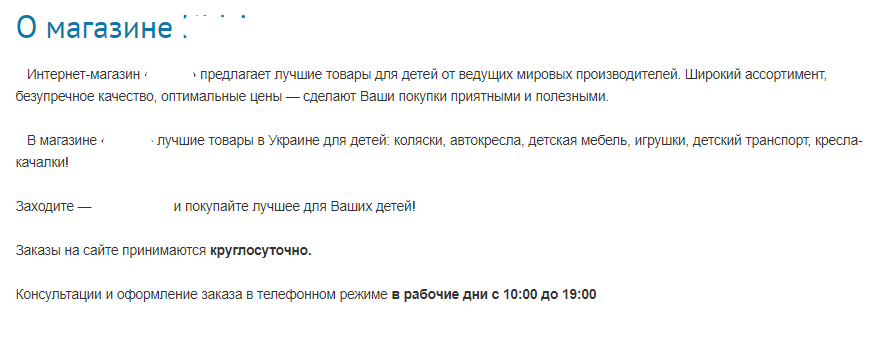
Это касается новых проектов, еще не успевших сделать себе имя. Для повышения доверия к себе рекомендую:
- дать максимум информации о доставке, гарантии, возврату товара при необходимости;
- дать контактную информацию – телефон, email, ссылки на мессенджеры, телефоны менеджеров;
- не лишними будут фото офиса, возможно, небольшие видео – зависит от направления работы.
Цель – завоевать доверие потребителей, на этом экономить не стоит.
Отсутствие SSL-сертификата

Если Вы не используете протокол HTTPS и не озаботились установкой SSL-сертификата, то Google Chrome пометит сайт как небезопасный. Часть пользователей просто закроет сайт, когда увидит это уведомление.
К тому же с 2014 г. HTTPS стал одним из факторов ранжирования сайта в поисковой выдаче. Так что SSL сертификат – обязательное условие для успешного интернет-магазина.
Чрезмерные меры безопасности
Здесь могу выделить:
- неуместные многократные проверки в процессе оформления заказа;
- требование обязательной регистрации;
- необходимость многократного прохождения защиты от ботов.
Помните – конкурентов много и конкуренция за покупателя идет очень жесткая. Любая мелочь может снизить конверсию.
Отсутствует адаптивность сайта для мобильных устройств
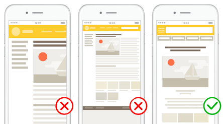
Адаптивность означает автоматическую коррекцию размеров блоков и прочих элементов сайта в зависимости от того, с какого устройства пользователь перешел на сайт.
В некоторых тематиках интернет-магазинов уже более 60% пользователей посещают его с мобильного телефона.
А 75% пользователей покинут сразу сайт, если он не удобен на мобильной версии.
Также удобство использования сайта с мобильных устройств – один из факторов ранжирования сайта. Так что адаптивность не только повышает комфорт работы с сайтом, но и улучшает его позиции в поисковой выдаче.
Случайные поп-ап окна
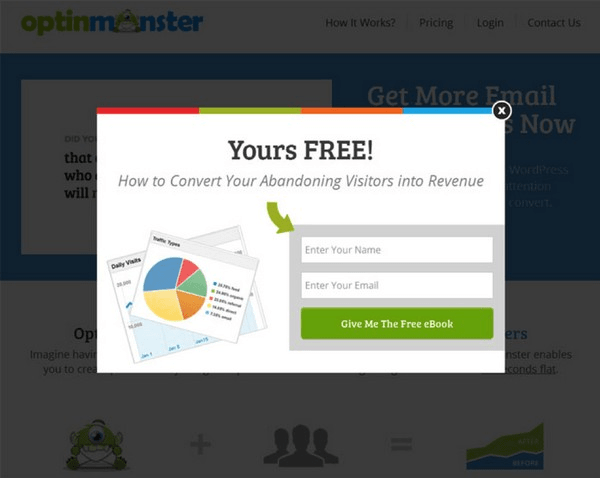
Сами по себе всплывающие окна – неплохой инструмент для привлечения внимания. Но они должны появляться в нужное время в нужном месте и не должны отвлекать внимание пользователя.
Дурной тон пытаться заполучить контактные данные с помощью случайных внезапных поп-ап окон. Это сильно раздражает посетителей и скорее всего они уйдут с сайта. Следует использовать только умные поп-ап формы, что позволяют показывать пользователю информацию только тогда, когда он к этому будет готов.
Поиск на сайте отсутствует или не работает
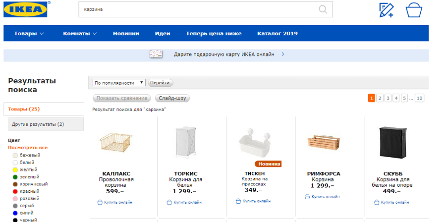
Никто не будет вручную перебирать все товары в категории. Если нет гибкого поиска с обилием фильтров – это приговор для интернет-магазина.
Поставьте себя на место покупателя. Вы заходите на сайт магазина, хотите выбрать смартфон, но поиска нет и вам нужно вручную перебрать 400-500 позиций. Станете вы это делать или закроете сайт, ответ, думаю, очевиден.
Вот 10 самых распространенных проблем, из-за наличия которых Ваш сайт или интернет-магазин не имеет продаж.
А как действительно понять, что именно не устраивает Ваших потенциальных клиентов на сайте и почему они не покупают?
Как проанализировать поведение посетителей вашего интернет-магазина и улучшить продажи благодаря карте кликов Plerdy?
Ниже – небольшая инструкция. В том же порядке можете самостоятельно с помощью сервиса Plerdy проанализировать свой сайт.
Регистрация в Plerdy
Для того, чтобы начать работу над анализом поведения Ваших потенциальных клиентов необходимо зарегистрироваться по этой ссылке.
Установка скрипта
Для того, чтобы сервис смог собирать данные о поведении Ваших клиентов необходимо на свой сайт установить скрипт. Действуем в следующем порядке:
- переходим в раздел “Настройки”;
- переходим во вкладку “Код отслеживания”;
- копируем код;
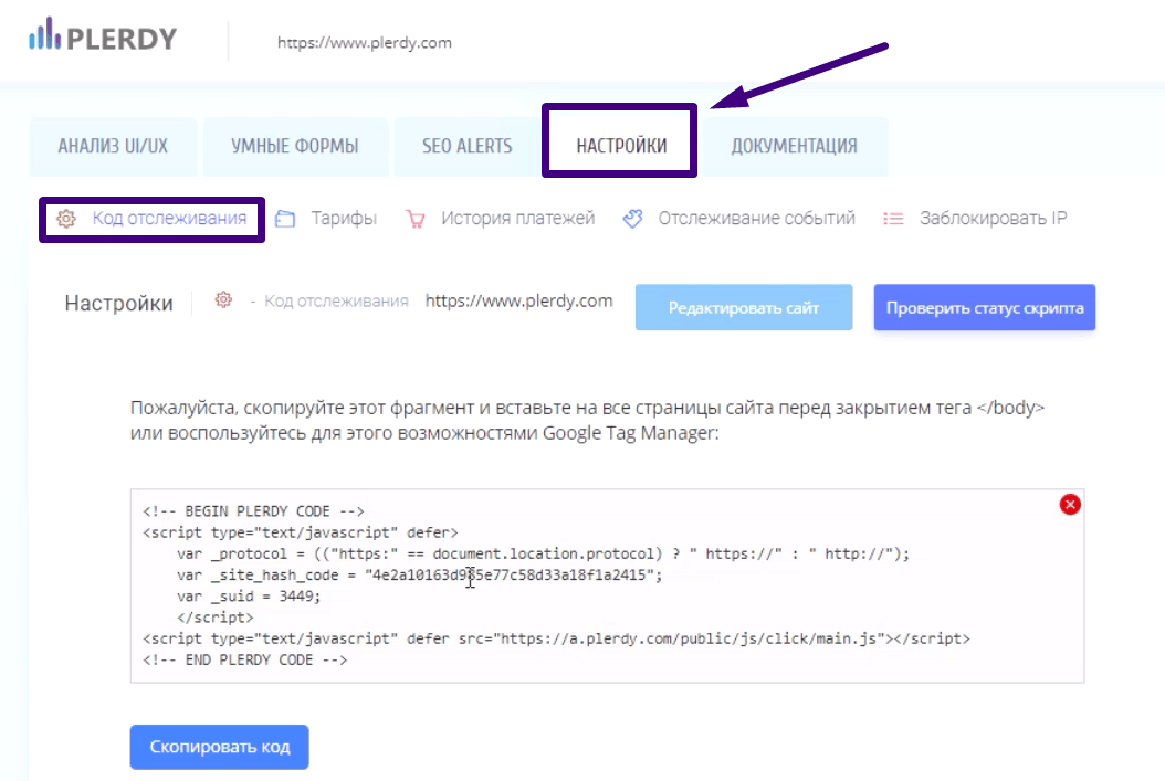
- вставляем его перед тегом </BODY>;
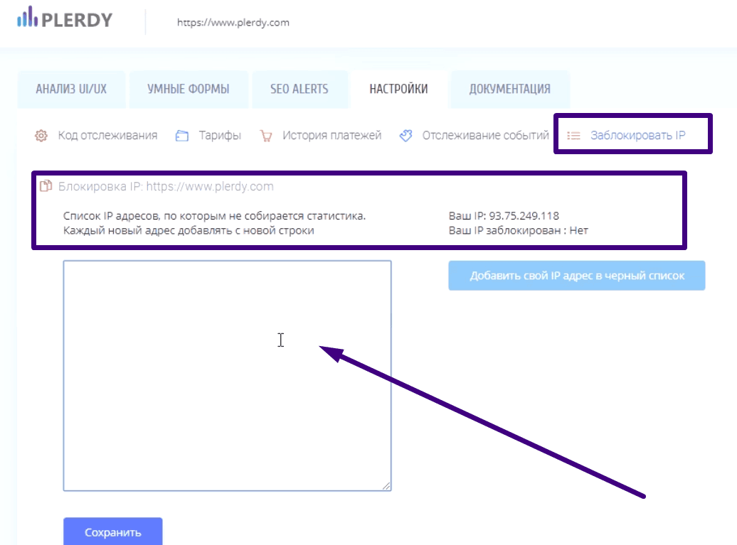
- в разделе “Заблокировать IP” можно указать те IP адреса, по которым статистика не будет собираться;
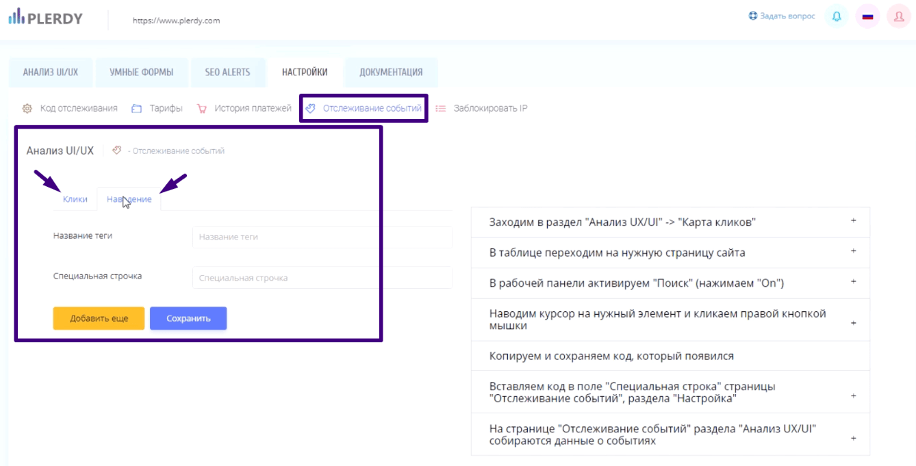
- вкладка “Отслеживание событий” – собирается статистика по кликам и наведениям;
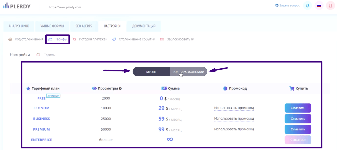
- вкладка “Тарифы” информация по месячным и годовым тарифам, их сравнение;
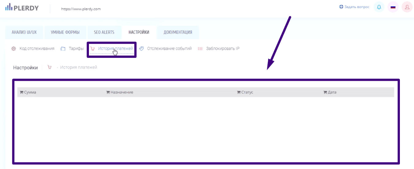
- вкладка “История платежей”, здесь отображается информация по оплате на данном аккаунте.
Учтите, после установки скрипта данные собираются сразу же. Их можно просматривать онлайн без дополнительных настроек.
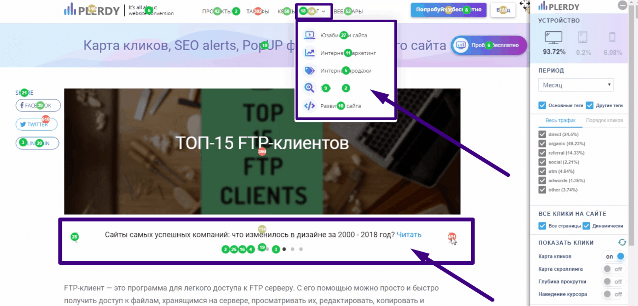
Как использовать карту кликов Plerdy?
Статистика сервиса Plerdy собирается по элементам верстки, а не попиксельно. Информация выводится непосредственно поверх элементов сайта. Подключается карта кликов с помощью нажатия клавиш Ctrl + ALT + H. После нажатия Вы увидите на сайте справа панель управления.
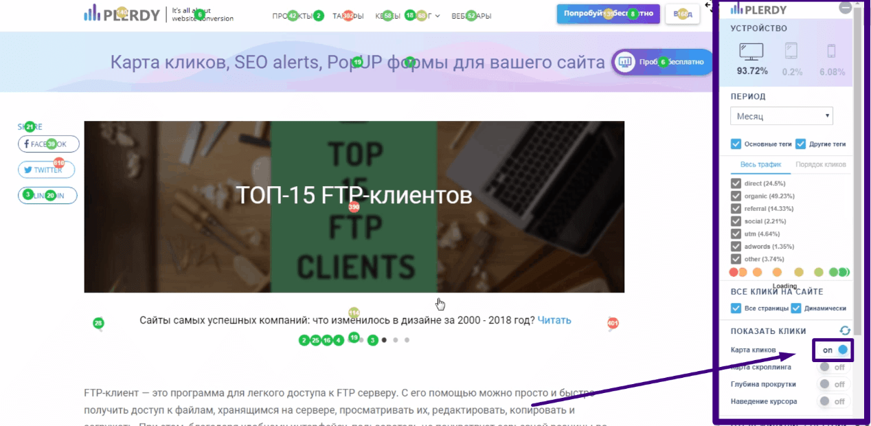
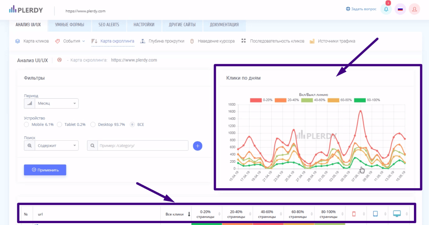
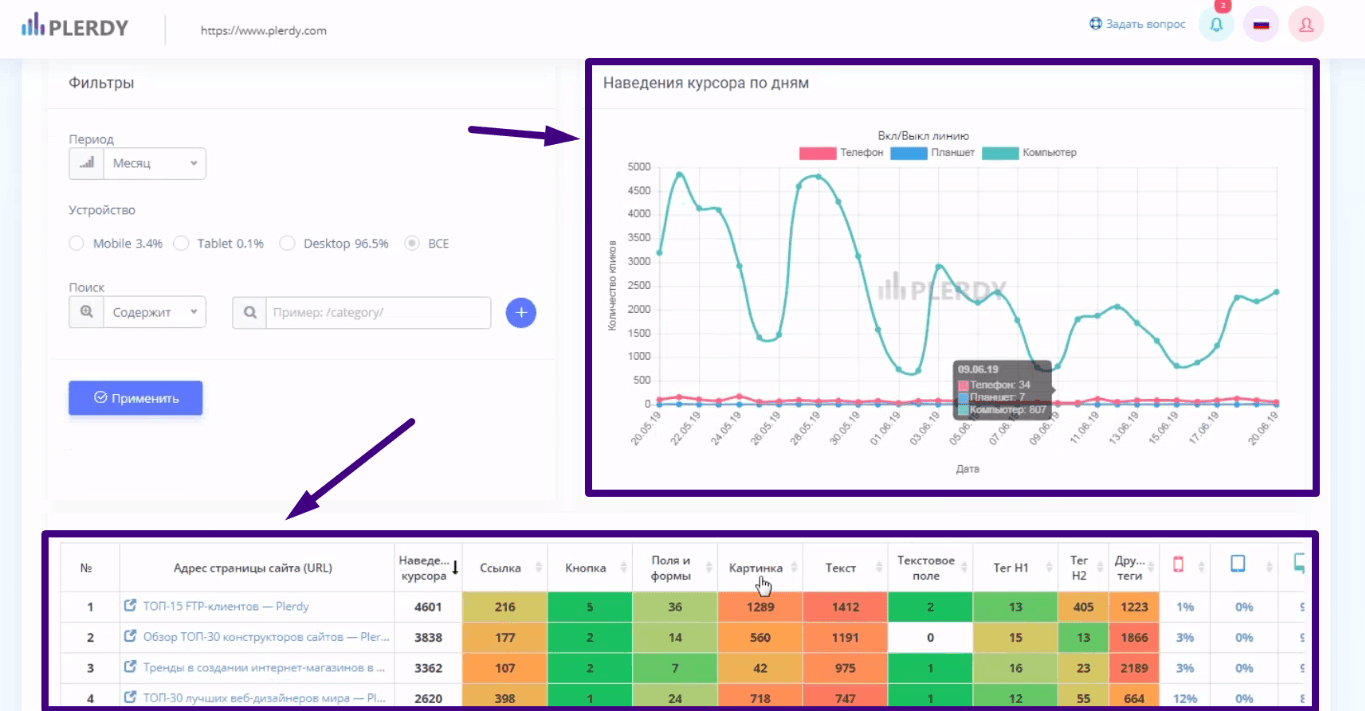
На панели управления Вы можете просмотреть информацию:
- по всем интерактивным и динамическим элементам;
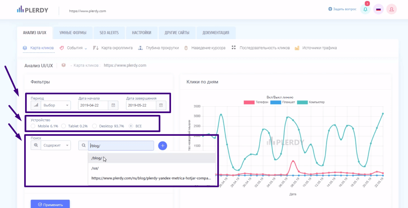
- данные в виде графика с сортировкой данных по типам устройства, с которого сделан вход на сайт, а также дате. Можно просмотреть отдельно статистику по странице или группе страниц с общей частью URL;
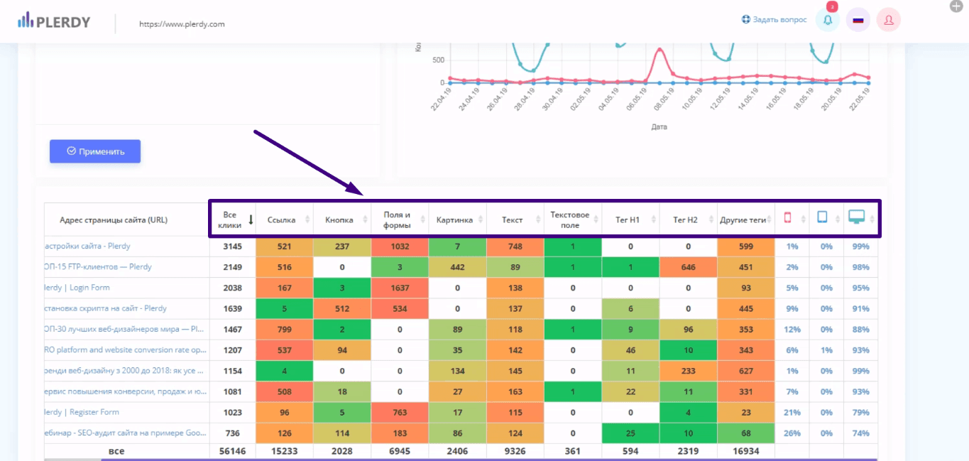
- таблица с информацией по кликам выглядит так.
Карта кликов нужна для того, чтобы понять, как посетители вели себя на сайте с разных каналов трафика. Также она дает понимание какие элементы на сайте вызывают интерес, помогает определять пробелы в дизайне.
Карта скроллинга и ее использование в анализе поведения посетителей сайта
Для работы с картой скроллинга:
- активируем показ этой статистики в правом меню;
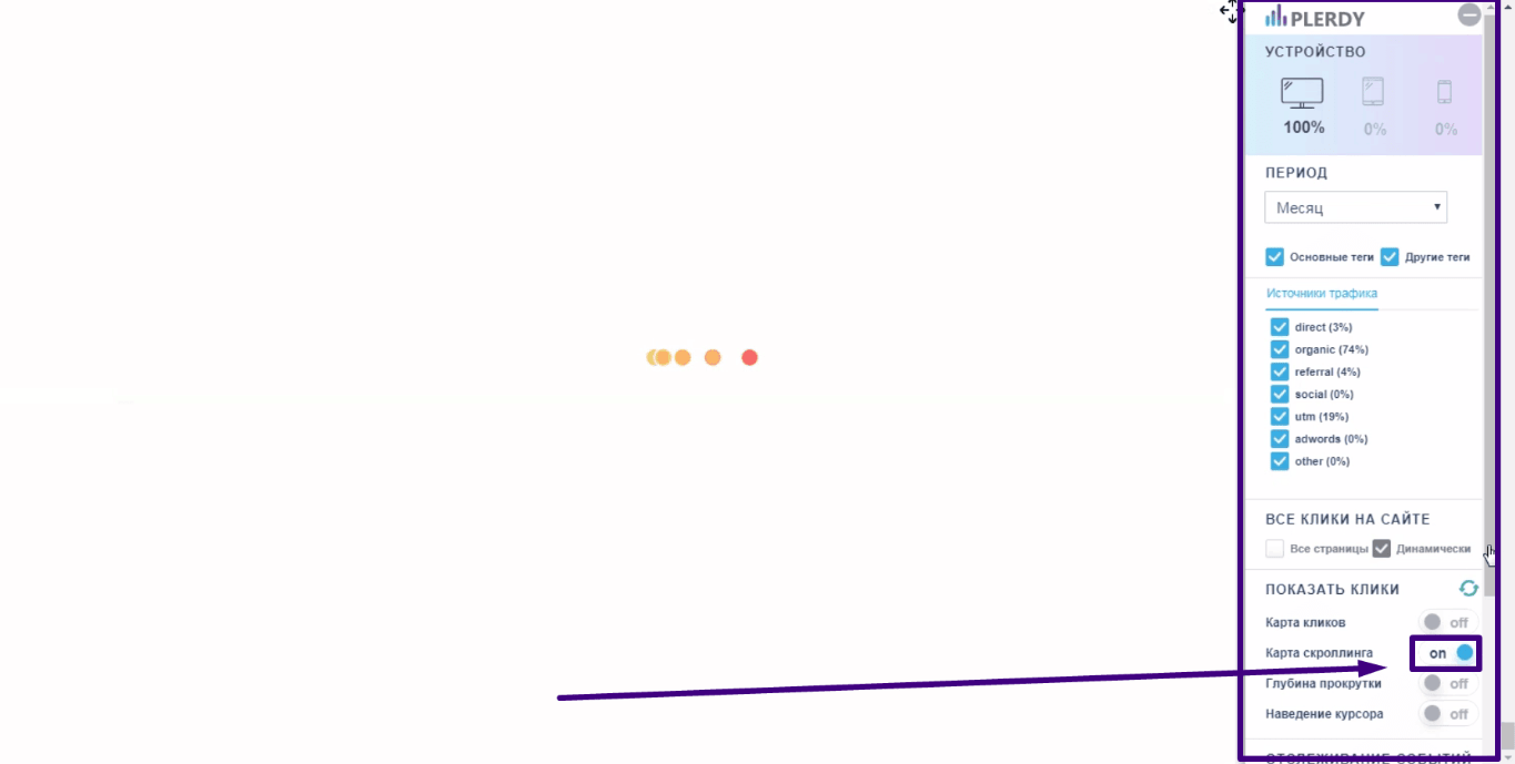
- просматриваем информацию по активности пользователей на разных экранах (частях) страницы. Таким образом Вы можете определить, где пользователи чаще всего осуществляют клик или заполняют форму или просто активно взаимодействуют с элементами сайта;

- те же данные сервис Plerdy позволяет просмотреть в виде графиков и таблиц.
Назначение карты скроллинга – дать информацию, какой из блоков на сайте вызывает наибольший интерес. Для размещения там основного призыва к действию.
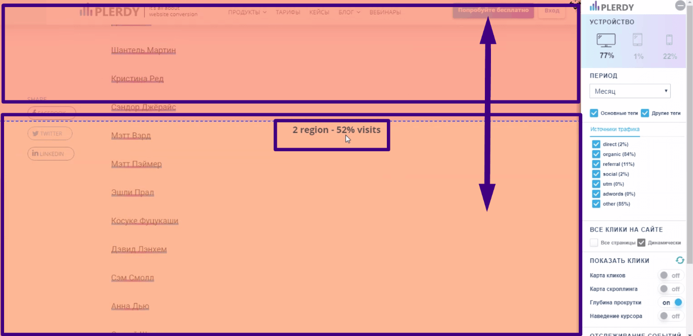
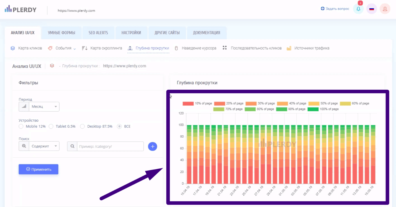
Глубина прокрутки и ее использование для анализа поведения посетителей сайта
Этот инструмент позволяет понять глубину ознакомления посетителей со страницей. Этот показатель характеризует качество контента.
- подключаем показ этой статистики через меню в правой части;
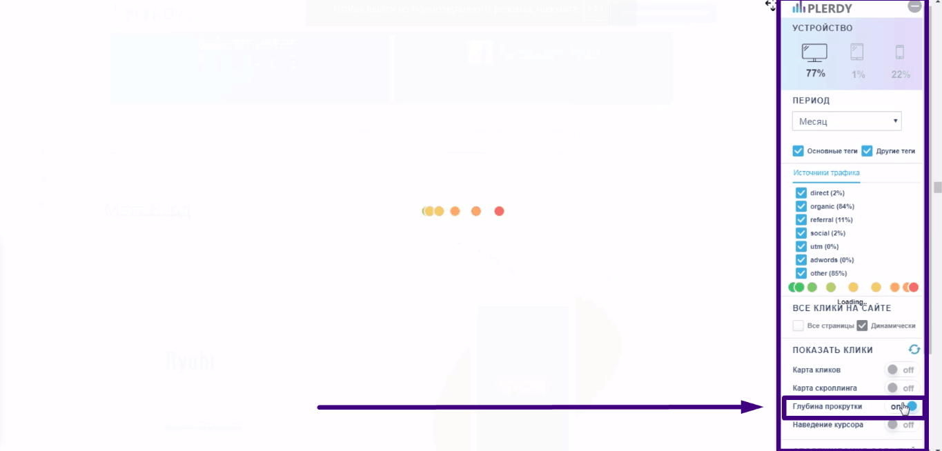
- клики не отображаются, только скролл. В этом отличие от карты скроллинга, в которой отображалось взаимодействие пользователей на определенных частях страницы;
- в виде графика статистика выглядит следующим образом;
- есть вариант отображения данных в табличной форме.
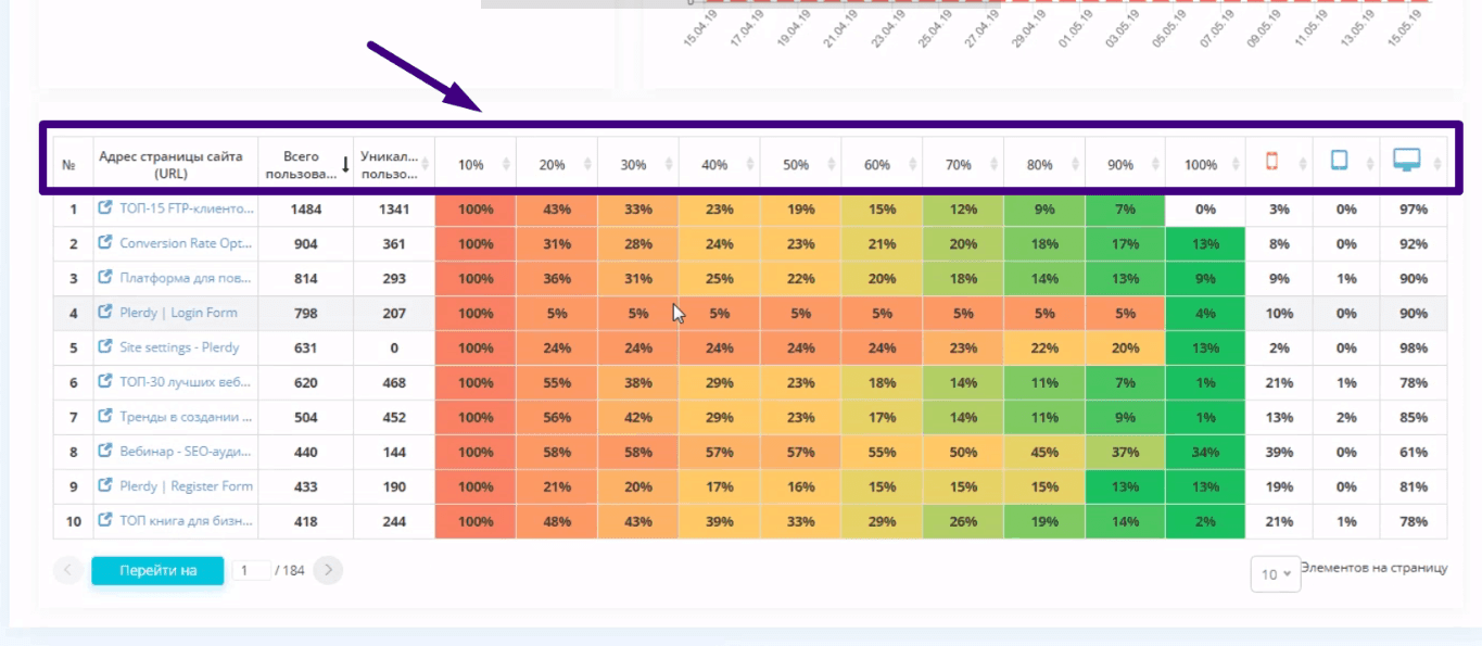
Этот инструмент применяйте при анализе текстов блогов, лендингов. Если посетители читают страницу полностью – все в порядке.
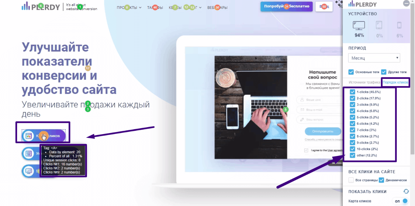
Последовательность кликов и ее использование при анализе поведения посетителей сайта
Этот сервис позволяет понять, куда переходят пользователи в первую очередь и куда во вторую.
- активируем показ этой статистики через правое меню;
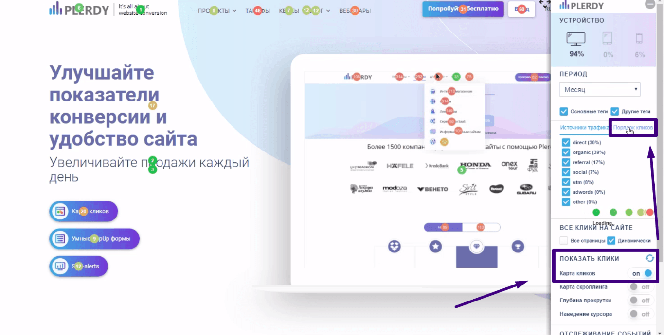
- в настройках указываем, по каким по очереди кликам нужно показывать статистику;

- ту же информацию можно изучить в виде графика и таблицы.
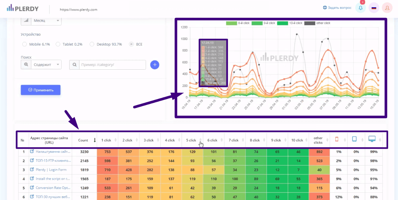
Эта статистика дает понимание того, что на сайте привлекает внимание посетителей. Комбинируя эти данные с наведением курсора получаем представление о поведении посетителей сайта.
Анализ наведения курсора
Помимо кликов важно анализировать и наведение курсора. Пользователи при ознакомлении с сайтом наводят курсор на интересующие их места, эта статистика также собирается:
- для ее показа нужно активировать соответствующий пункт в правом меню на сайте;
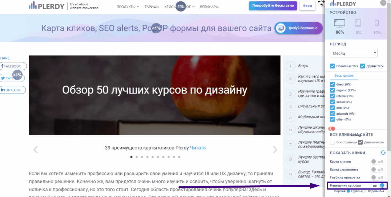
- элементы на сайте группируются в блоки и по ним ведется статистика по наведениям курсоров (2+ секунд без клика);
- эта же информация доступна в виде графика и таблицы с группировкой данных по устройствам, с которых выполнен вход на сайт.
Данные по наведению полезны в частности при анализе длинных текстов. Пользователь, как правило, устанавливает курсор на особо интересных для него местах. То же касается и сайта в целом.
Выводы
Качественного продукта недостаточно для успеха интернет-магазина. Если сайт будет неудобным, посетители просто не будут терять время на знакомство с вашим предложением. Итог – отсутствие притока клиентов и мизерная конверсия.
Анализ тепловых карт кликов, скроллинга, глубины прокрутки, последовательности кликов, данных по наведению курсора дает представление о том интересен ли сайт посетителям. Без этой статистики вы не будете понимать в каком направлении двигаться, что мешает росту конверсии. Всю перечисленную статистику собирает Plerdy, сервис удобен тем, что данные передаются в личный кабинет и их можно изучать онлайн.
Эксперт в области интернет-маркетинга. Руководитель маркетингового агентства MAVR.
Бизнес-степень «Мастер делового администрирования» (MBA).