
SEO audit – Manual site analysis, part 2
I continue a series of articles on the topic “Audit of the site”. In the first part, we talked about collecting information from the Client, the next step will be a manual analysis of the site.
Manual site analysis
The first thing I do when I visit a Client’s website is its visual and user analysis. Those. I immediately note all the shortcomings in the layout, design, and also see what is the ultimate goal of the visitor to this site? If a purchase, then first of all you need to test the basket, registration, personal account, and so on. The question that constantly sits in my head is: “What problems does the user of this site face?”. You need to find them and eliminate them.
Program minimum:
Open as many different pages of the site as possible. If this is an online store: product card, category, subcategory, pages with filters and sorting, service pages, such as delivery and payment, promotions and new items. If this is a service site, go through the services, open the contact page, look at the price list, is there a blog or a news section.
We pay attention to the template of the same type of pages, study the structure, content, content types. We write out all the errors and problems immediately to ourselves.
For example, a b2b product card for a company:
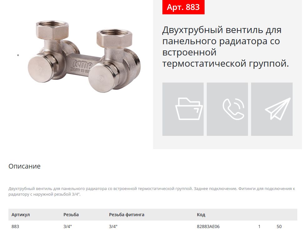
Content content is minimal. In this case, it is necessary to expand the product description, add photos, instructions, add the ability to comment.
And here we see the problem of the user. When you click on a call (Order a callback) or on an “airplane” (Contact by email), we see a pop-up window that cannot be closed and still remain on the same page. When we close, we go to a blank page. It looks like this:
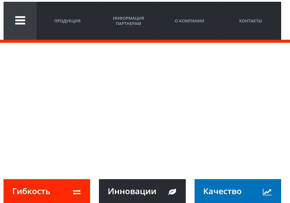
In order to return to the same product card, you need to visit the browser twice!!! Click on the “Go to the previous page” arrow.
There can be many such problems and our goal is to identify them all. And so once again I emphasize that such a check, especially of conversion forms and buttons, must be tested at least once a week.
Add SPAM
The first place people like to spam is in the comment form.
For example, here on this site you can leave a comment without pre-moderation at any time.
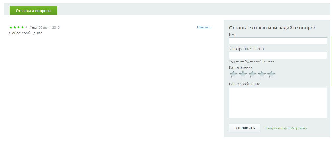
I would still recommend using pre-moderation, and then publishing it after analyzing the review.
What else needs to be checked?
Pay attention to how content is created. For example, sometimes site owners use the autocomplete module for product descriptions, or parse all content from competitors (descriptions, characteristics, photos). There is also a synonym for describing categories and subcategories.
Sometimes someone else’s content is simply integrated into the site (widget, rss or other way).
In the screenshot, the “news” block aggregates news from news sites.
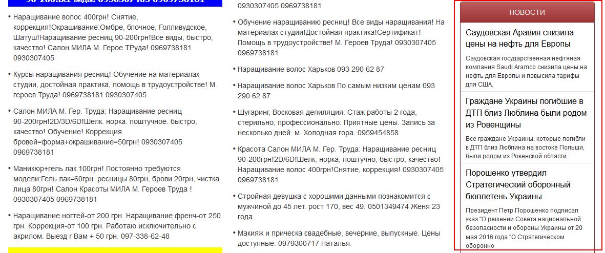
In such cases, it is necessary to look at the feasibility of such modules.
And more about the content. Articles should be published regularly (determine the frequency according to your capabilities, at least once every 2 weeks). News should also be regular. You either update them regularly, or don’t use this block of information at all.
All information on the site must be up to date! This is especially true for online stores. You only post actual prices. The relevance of email, phone numbers, addresses, etc. is also rechecked.
Internet marketing expert. Head of marketing agency MAVR.
Business degree “Master of Business Administration” (MBA).